
Working with search panels and data grids
Filters, sorting, paging, row actions, batch actions and exports — the same on every page.
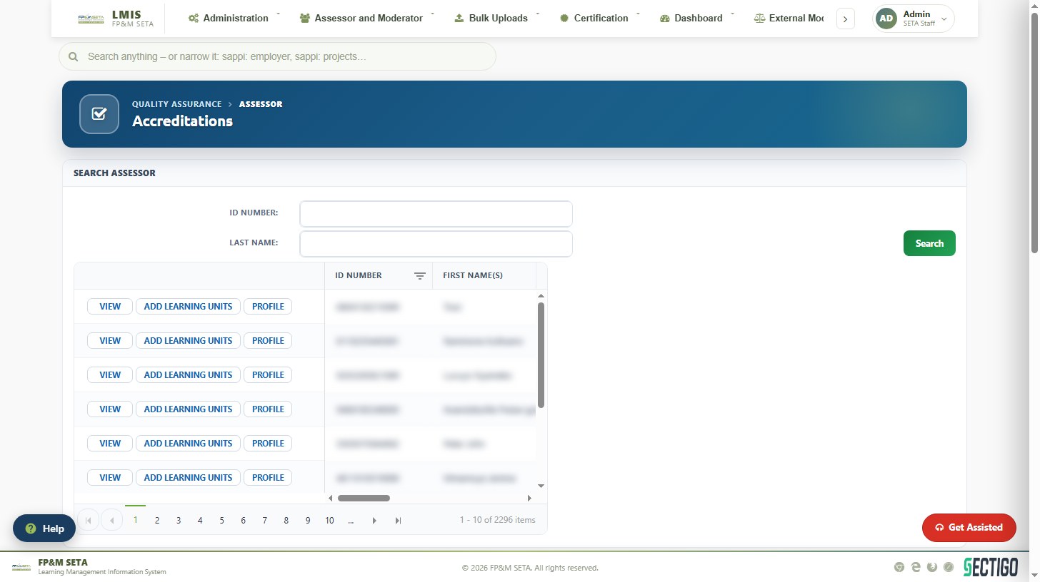
Most pages follow the same pattern: a search panel at the top, a data grid with the results and, below or beside the grid, a detail panel for the selected record. The grid controls are the same everywhere in LMIS.
| Control | How to use it |
|---|---|
| Search panel | Enter one or more criteria and click Search. Where the panel says At least one filter is required the grid stays empty until you search. Clear or Reset starts again. |
| Column filter (funnel icon) | Click the funnel on a column heading to filter that column (contains, equals, starts with, date ranges…). Filtered columns show a highlighted icon. |
| Sorting | Click a column heading to sort ascending; click again for descending. |
| Grouping | On grids that show Drag a column header and drop it here to group by that column, drag a heading into the bar to group the rows. |
| Paging | Use the ** |
| Row actions | Buttons at the start of each row open the record: View (read-only), Profile (full record), Edit, Docs, Delete, Approve… The eye icon gives a quick look without leaving the grid. |
| Select / Select All | Tick the boxes in the Select column (or Select All) before a batch action such as Send Activation Emails, Print Certificate or Allocate Evaluator. |
| Export | Export (or Export to Excel / Export PDF) downloads the current result set — filters and all. |
| Tabs | Tabs across the top of a page split a workflow into stages (Pending Approval, Approved, Query…). The number badge shows how many records are in that stage. |
| Drop-down lists | Lists marked -- type and/or select -- accept typing: start typing to filter, then click the value. |
| Date fields | Type the date as YYYY-MM-DD or click the calendar icon. |
| Collapsible panels | Section headers with a – or > icon can be collapsed and expanded. |
Note
Red text in a grid or KPI card draws attention to something that needs action — lapsed registrations, overdue items or a record that failed a Home Affairs check. Green indicates a completed or verified state.
Was this article helpful?Thank you for your feedback.